


Absence is the only creative choice that asks the audience to do the work. Remove the heart from I ❤️ NY and you're not making a quieter ad — you're making an argument that a full logo couldn't carry. The gap becomes the message. Here are seven tactics from the Creative Tactics Engine that use absence as the argument.
- Symbolic Absence
- Underline the Benefit
- Highlight Diversity by Subtraction
- Cut the Waste
- Tell the Story Through Absence
- Erase the Dominant Narrative
- Invite the Audience to Complete It
1. Symbolic Absence
Remove a familiar icon — and make people feel its weight for the first time.
I [No Heart] NY — LiveOnNY, 2024
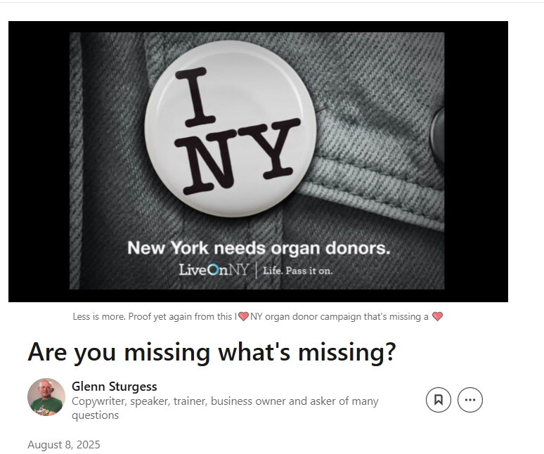
The "I ❤️ NY" logo is forty-five years old. Everyone has seen it on a tote bag. LiveOnNY removed the heart — the single element that makes the mark legible — to dramatise the organ donation crisis in New York. No explanatory copy needed. The missing heart was both the problem and the ask. One deletion turned cultural wallpaper into an emergency signal.
Missing Type — NHS Blood & Transplant / MediaCom, 2017: Letters A, B and O were removed in OOH posters of familiar cultural symbols across the UK. The structural absence of three letters mapped directly onto the absence of three blood types — and drove a measurable uplift in donor registrations..
2. Underline the Benefit
Strip away the thing the product replaces — and what's left is the proof.
Naked Pasta - Dolmio, T&P, 2025
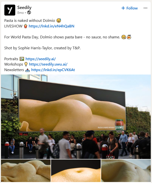
Pasta is one of Britain's favourite foods. It is also, without sauce, essentially naked. Dolmio made that literal. Working with body photographer Sophie Harris-Taylor, they shot pasta styled as body parts and ran the images on OOH across London and Manchester for World Pasta Day. No sauce in shot. No product. Just exposed pasta, bare without its partner. The missing ingredient was the entire argument. Dolmio didn't need to say their sauce completes the dish. The ads made you feel the incompleteness before you'd read a word.
Nicorette — No Matches Needed. Open a matchbox. It's empty. No headline required. The product logic completes itself: if you're not smoking, you don't need matches. One removed object, one product truth, zero wasted words. Nike — No "L" in Arsenal, 2004: Removed the "L" from the club's name to mark an undefeated season. The missing letter was the missing loss. Alka-Seltzer — Man Overboard: Two shipwrecked men on a boat. Then one. Voiceover: "For when you've eaten something you shouldn't."
3. Highlight Diversity by Subtraction
Remove the people others ignore — and show what's left without them.
England Without Migration — Migration Museum, Wonderhood Studios, 2024
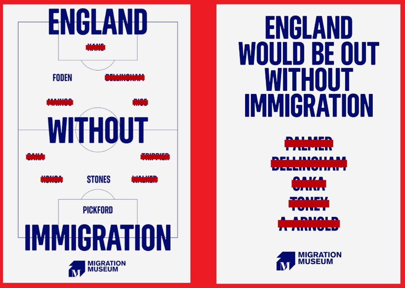
The aim was to place migration at the heart of fan conversations during England's great run during Euro 2024. Working with Wonderhood Studios, the Migration Museum crossed out the names of every England player with migrant heritage and asked fans to look at what remained. Bellingham, Kane, Saka: gone. Foden, Stones, Pickford: still there. The campaign updated in real time across the tournament — pub screens, social, OOH — tracking England's progress and recalculating the crossed-out contribution at each stage. By the final, 16 of the 21 players who'd appeared on the pitch were born outside the UK or had at least one parent or grandparent born abroad. The graphic reached millions. The crossed-out names didn't tell people what to think about immigration. They gave fans something specific to talk about, in a context they already cared about.
The Most German Supermarket — EDEKA, 2018: Emptied shelves of all non-German products. The bare aisles didn't need a caption. The absence made the economic and cultural argument that copy couldn't.
4. Cut the Waste
Omit the harmful element — and let its absence become the message.
Corona — Return Your Bottle, David, 2023
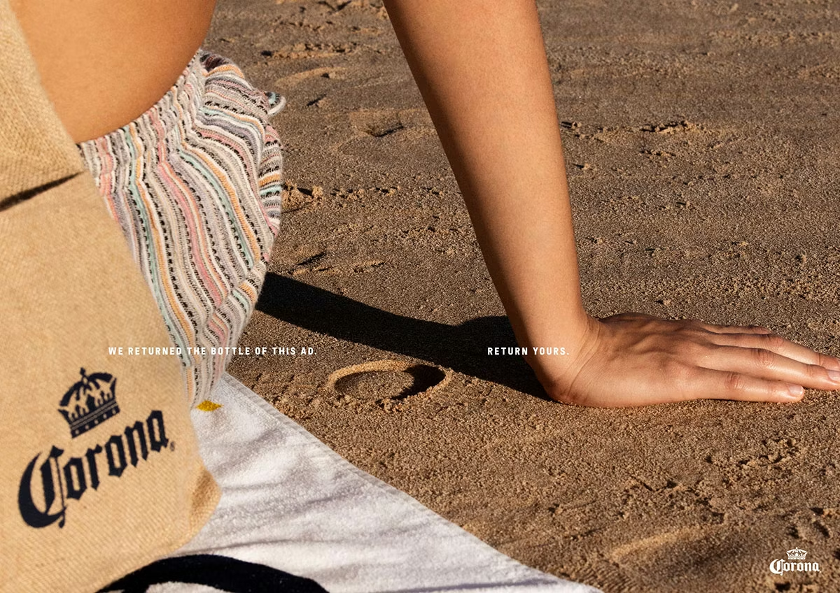
The objective was simple: get people to recycle their bottles. To do so, Corona ran five OOH summer beach ads with no bottle in them. The hands are there. The sandy imprint where the bottle sat is still there. The product isn't. A single line did the rest: We returned the bottle of this ad. Return yours. The brand had performed the behaviour it was asking for — removed the bottle, correctly, before the consumer saw the ad. The missing product wasn't a creative flourish. It was a demonstration. Corona didn't appeal to people's environmental conscience. It showed them what done looks like and, in doing so, encouraged them to do the same with disarming charm. .
The Dissolving Bottle — BBDO, 2021: An eco shampoo bottle that disappears. The packaging omitted from existence. Waste wasn't reduced — it was designed out. The absence of the bottle was the whole brand story.